MantisBT - Zandronum |
| View Issue Details |
|
| ID | Project | Category | View Status | Date Submitted | Last Update |
| 0004385 | Zandronum | [All Projects] Suggestion | public | 2024-08-16 06:07 | 2024-08-26 09:36 |
|
| Reporter | unknownna | |
| Assigned To | Kaminsky | |
| Priority | normal | Severity | tweak | Reproducibility | N/A |
| Status | resolved | Resolution | fixed | |
| Platform | | OS | | OS Version | |
| Product Version | | |
| Target Version | 3.2 | Fixed in Version | 3.2 | |
|
| Summary | 0004385: [3.2] Change "1st 2nd 3rd" place colors on scoreboard from blue, red and green |
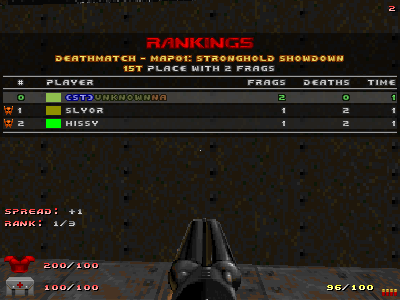
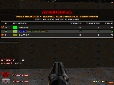
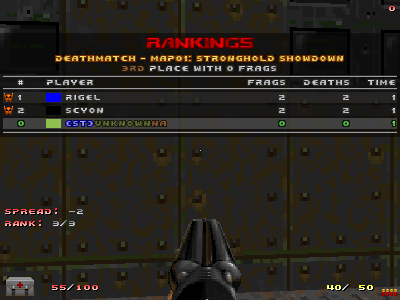
| Description | After looking at the new scoreboard, I thought it would maybe be a good idea to change the ranking colors from "1st blue", "2nd red" and "3rd green" to colors that match gold, silver and bronze, that are more traditionally used for 1st, 2nd and 3rd rankings.
Maybe use gold or yellow for 1st, dark gray or tan for 2nd, and orange or dark brown for 3rd.
Using yellow for 1st would make it not clash with the header color above it.
See the attached mock-up screenshots. |
| Steps To Reproduce | |
| Additional Information | It would perhaps make it slightly easier to read the scoreboard since you wouldn't see the darker red and blue colors as rankings that feel more like team colors.
Changing it however would definitely transform the look and feel of the scoreboard. |
| Tags | No tags attached. |
| Relationships | | related to | 0001829 | resolved | Kaminsky | Customizable scoreboard |
|
| Attached Files |  1st_gold.png (21,106) 2024-08-16 06:07 1st_gold.png (21,106) 2024-08-16 06:07
/tracker/file_download.php?file_id=3086&type=bug

 1st_yellow.png (36,776) 2024-08-16 06:07 1st_yellow.png (36,776) 2024-08-16 06:07
/tracker/file_download.php?file_id=3087&type=bug

 2nd_darkgray.png (22,411) 2024-08-16 06:08 2nd_darkgray.png (22,411) 2024-08-16 06:08
/tracker/file_download.php?file_id=3088&type=bug

 3rd_darkbrown.png (18,159) 2024-08-16 06:08 3rd_darkbrown.png (18,159) 2024-08-16 06:08
/tracker/file_download.php?file_id=3089&type=bug

 3rd_orange.png (18,259) 2024-08-16 06:08 3rd_orange.png (18,259) 2024-08-16 06:08
/tracker/file_download.php?file_id=3090&type=bug

|
|
| Issue History |
| Date Modified | Username | Field | Change |
| 2024-08-16 06:07 | unknownna | New Issue | |
| 2024-08-16 06:07 | unknownna | File Added: 1st_gold.png | |
| 2024-08-16 06:07 | unknownna | File Added: 1st_yellow.png | |
| 2024-08-16 06:08 | unknownna | File Added: 2nd_darkgray.png | |
| 2024-08-16 06:08 | unknownna | File Added: 3rd_darkbrown.png | |
| 2024-08-16 06:08 | unknownna | File Added: 3rd_orange.png | |
| 2024-08-18 04:11 | Kaminsky | Note Added: 0023950 | |
| 2024-08-18 04:11 | Kaminsky | Assigned To | => Kaminsky |
| 2024-08-18 04:11 | Kaminsky | Status | new => needs review |
| 2024-08-18 04:11 | Kaminsky | Target Version | => 3.2 |
| 2024-08-18 04:12 | Kaminsky | Relationship added | related to 0001829 |
| 2024-08-18 08:49 | unknownna | Note Added: 0023958 | |
| 2024-08-18 08:49 | unknownna | Status | needs review => feedback |
| 2024-08-25 13:28 | Kaminsky | Note Added: 0023966 | |
| 2024-08-25 13:28 | Kaminsky | Status | feedback => needs review |
| 2024-08-25 14:37 | Kaminsky | Note Edited: 0023966 | bug_revision_view_page.php?bugnote_id=23966#r14357 |
| 2024-08-25 14:37 | Kaminsky | Status | needs review => needs testing |
| 2024-08-26 09:36 | unknownna | Note Added: 0023972 | |
| 2024-08-26 09:36 | unknownna | Status | needs testing => resolved |
| 2024-08-26 09:36 | unknownna | Fixed in Version | => 3.2 |
| 2024-08-26 09:36 | unknownna | Resolution | open => fixed |
|
Notes |
|
|
|
|
|
|
|
Thanks for looking into this!
I just want to confirm 2 things before marking this as resolved, since this is also going to affect the large frag messages.
* I installed Quake 3 again, and it seems that it uses blue for 1st, red for 2nd and yellow for 3rd. I assume Skulltag was trying to emulate this look, but using green for 3rd instead of yellow. If we change these colors now, we deviate from this older Quake 3 look and move on to something new. I hope this is ok. At least I think the newer colors are easier to read with the smaller Doom font.
* Did you deliberately use brown instead of dark brown for 3rd? Just want to be sure if it looked better to you. I think dark brown might look better personally, but I play with high gamma so it probably looks different to me. |
|
|
|
(0023966)
|
|
Kaminsky
|
2024-08-25 13:28
(edited on: 2024-08-25 14:37) |
|
Quote from "unknownna"
I installed Quake 3 again, and it seems that it uses blue for 1st, red for 2nd and yellow for 3rd. I assume Skulltag was trying to emulate this look, but using green for 3rd instead of yellow. If we change these colors now, we deviate from this older Quake 3 look and move on to something new. I hope this is ok. At least I think the newer colors are easier to read with the smaller Doom font.
While Skulltag tried to mimic Quake 3 on a lot of things, including the old scoreboard and medal system, I don't think it matters if we deviate from this. At this point, a lot of things from the Skulltag era that are reminiscent of Quake 3 have changed significantly. The newer text colours here look better and fit with the more traditional use of colours used for 1st, 2nd, and 3rd place.
Quote from "unknownna"
Did you deliberately use brown instead of dark brown for 3rd? Just want to be sure if it looked better to you.
I'll admit, I didn't take a very close look at your screenshot(s) to notice that you were actually using the darker brown text colour instead of the regular one (and I entirely missed reading "dark brown" and focused more on "bronze"). My screen was a bit brighter, so it appeared like the latter when I glanced at it. The current brown text colour can still work, but I'll agree that dark brown works better.
It wasn't a big deal to change this:'https://foss.heptapod.net/zandronum/zandronum-stable/-/commit/ab45af7bfb8eb0fcd616afac984f185c78fefbc7 [^]'
|
|
|
|
|
|
I'm glad to hear that. In that case, this works perfectly and can be marked as resolved. Thanks! |
|