MantisBT - Doomseeker |
| View Issue Details |
|
| ID | Project | Category | View Status | Date Submitted | Last Update |
| 0003984 | Doomseeker | UI | public | 2022-03-24 15:18 | 2022-05-28 14:51 |
|
| Reporter | WubTheCaptain | |
| Assigned To | | |
| Priority | none | Severity | minor | Reproducibility | sometimes |
| Status | new | Resolution | open | |
| Platform | | OS | | OS Version | |
| Product Version | 1.3.2 | |
| Target Version | | Fixed in Version | | |
|
| Summary | 0003984: The main UI (server browser) can present too much (unnecessary) information at once |
| Description | Discussion in issue 0003968's notes brought up conversation about where server details should be shown. After some thought, I think the main UI presents (at worst) too much information. I see this as an accessibility issue, particularly for new users. The UI makes me think (too much) what I need to do, even as an experienced user. Sometimes I need to read to know what a checkbox, a text field or something does, it's not a fondly memorable part of the interface. (For me, the memorable parts of the interface are: Double-clicking a server joins a server, where the "Create Game" button is located, and where the search is located.)
I don't want to see the "address" or "WADs" information presented to me immediately, or fine server details about what it's running. The server name most likely conveys that information me already. |
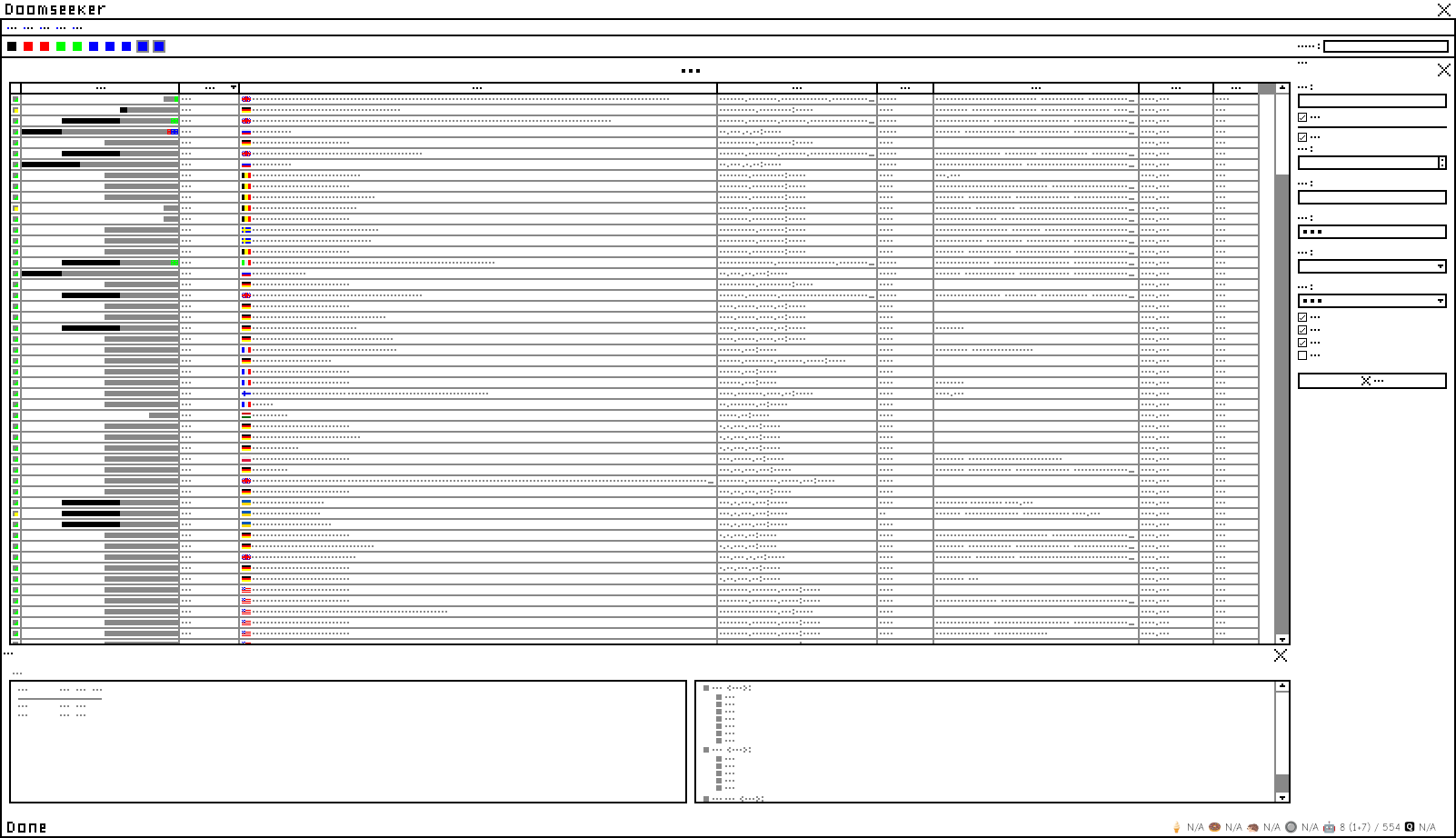
| Steps To Reproduce | Attached illustration, mimicking my common configuration and how I may feel about Doomseeker when returning to it from a hiatus. I drew it deliberately to make it more challenging for experienced users, to have a little bit of insight how a new user may see the program.
Some food for thought. Imagining using this illustrated interface (as a new user), could you...
- ...find (or search) for a server by name?
- ...find and join your Hungarian friend's server (by flag)?
- ...find and join your German friend's server (by flag)?
- ...find and join your Brazilian friend's server (by flag)?
- ...understand what the bars on the left represent? Can they be understood as progress indicators? What do the colors represent?
- ...understand what the icons left-most of the bars represent? How do you feel about them perceived as illustrated?
- ...navigate effortlessly to the "Create Game" dialog?
- ...search and limit display to all servers hosted in $country?
- ...describe or make use of each of the server browser columns from the illustrated information? Could you do so when allowed to read the server name?
- ...tell what the bottom panel says on the left?
- ...tell what the bottom panel says on the right?
- ...describe each of the checkboxes on the right from off the top of your head?
- ...describe each of the textboxes on the right from off the top of your head?
- ...describe what the numbers and "N/A" are at the bottom right corner (without the tooltip)? Is "N/A" understandable?
|
| Additional Information | |
| Tags | No tags attached. |
| Relationships | | related to | 0004005 | acknowledged | | Unable to search and sort servers by country flag |
|
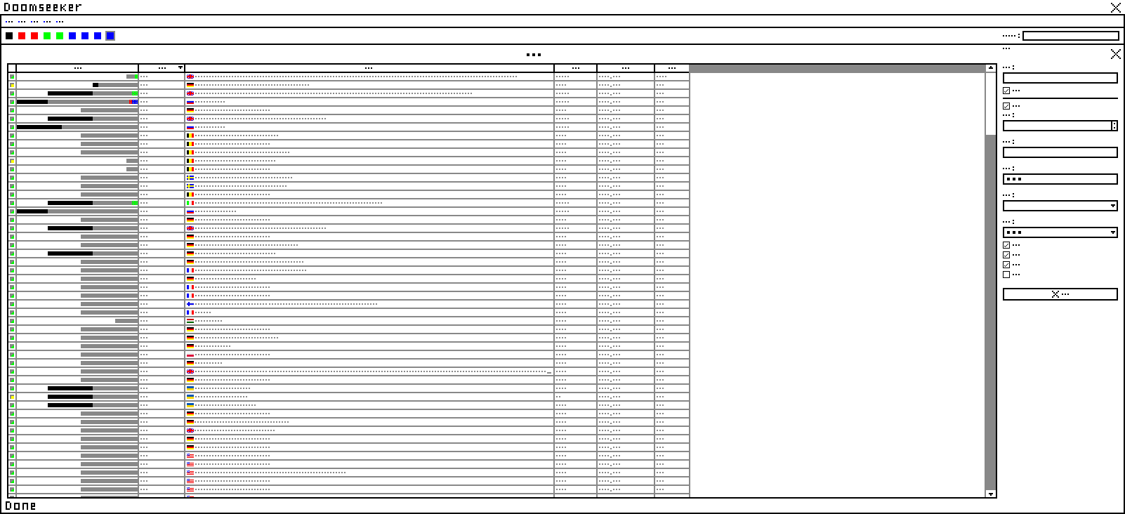
| Attached Files |  Doomseeker 1.3.2 main UI illustrated by WubTheCaptain.png (27,608) 2022-03-24 15:18 Doomseeker 1.3.2 main UI illustrated by WubTheCaptain.png (27,608) 2022-03-24 15:18
/tracker/file_download.php?file_id=2722&type=bug
Doomseeker reduced UI illustrated by WubTheCaptain.png (16,629) 2022-03-24 15:19
/tracker/file_download.php?file_id=2724&type=bug
|
|
| Issue History |
| Date Modified | Username | Field | Change |
| 2022-03-24 15:18 | WubTheCaptain | New Issue | |
| 2022-03-24 15:18 | WubTheCaptain | File Added: Doomseeker 1.3.2 main UI illustrated by WubTheCaptain.png | |
| 2022-03-24 15:18 | WubTheCaptain | File Added: Doomseeker reduced UI illustrated by WubTheCaptain.png | |
| 2022-03-24 15:18 | WubTheCaptain | File Deleted: Doomseeker reduced UI illustrated by WubTheCaptain.png | |
| 2022-03-24 15:19 | WubTheCaptain | File Added: Doomseeker reduced UI illustrated by WubTheCaptain.png | |
| 2022-03-24 15:24 | WubTheCaptain | Note Added: 0022159 | |
| 2022-03-24 15:24 | WubTheCaptain | Note Edited: 0022159 | bug_revision_view_page.php?bugnote_id=22159#r13583 |
| 2022-03-24 16:01 | WubTheCaptain | Note Added: 0022162 | |
| 2022-03-24 22:58 | Blzut3 | Note Added: 0022165 | |
| 2022-05-28 12:41 | WubTheCaptain | Note Added: 0022232 | |
| 2022-05-28 12:42 | WubTheCaptain | Note Edited: 0022232 | bug_revision_view_page.php?bugnote_id=22232#r13601 |
| 2022-05-28 12:43 | WubTheCaptain | Priority | low => none |
| 2022-05-28 14:37 | WubTheCaptain | Note Added: 0022239 | |
| 2022-05-28 14:39 | WubTheCaptain | Note Edited: 0022239 | bug_revision_view_page.php?bugnote_id=22239#r13615 |
| 2022-05-28 14:51 | WubTheCaptain | Relationship added | related to 0004005 |
|
Notes |
|
|
|
Imagining using this illustrated interface (as a new user), could you...
- with an user interface that presents the "X" buttons, find the correct "X" button to close the program?
|
|
|
|
|
|
If this issue needs to be summarized someway else, it's imho that any panels attached to the main server browser UI suck. I can't imagine them being improved to the extent of being good (an exception may be the "buddies" panel, which I don't use). |
|
|
|
(0022165)
|
|
Blzut3
|
|
2022-03-24 22:58
|
|
|
The buddies panel definitely has room for improvement, and honestly the panel that I'm least happy with from a design perspective. People definitely use it, but I can't say I've been particularly happy with the UX. Just been short of ideas on how to do it better. |
|
|
|
(0022232)
|
|
WubTheCaptain
|
2022-05-28 12:41
(edited on: 2022-05-28 12:42) |
|
I proposed in note 0004002:0022231 replacing the server filtering checkboxes (or the advanced version of it) with text based syntax, such as "country:CH" to search for servers the IP2C database returns geolocation data to Switzerland, or "-TSPG" to exclude servers with "TSPG" in name. It could solve a lot of issues listed in OP, at a cost of plausibly decreased new user experience if the syntax is too intricate.
|
|
|
|
(0022239)
|
|
WubTheCaptain
|
2022-05-28 14:37
(edited on: 2022-05-28 14:39) |
|
Quote from WubTheCaptain
"country:CH"
This may run into issues with localization support, unlikely to be ever localized. But also, support for Unicode representation: 🇨🇭.
|
|